

After using Github for my daily work, I have come to the conclusion that Github... kind of sucks.
I know this is a bit of a hot take.
To give credit where credit is due, the infrastructure behind the service is plenty impressive. And the code search is great as well!
The user interface for Github.com, on the other hand, is not great for daily operation. Let me tell you why -
No way to filter active comments
If there is a review that has had some back-and-forth from the dev and the reviewer, there may be a dozen comments or more.
The only way to find which comments are still open is to scroll through the page and look for open comments. These open comments may be flaked in between other comments, pushes, etc. You have to kind of mentally avoid other things that your eyes happen to catch on to.
Resolved comments are collapsed by the way, which is great. But even better would be if we had a list of just active comments that got smaller as you resolved them. Reducing items on the screen with each click = satisfying and rewarding for the developer.
Azure DevOps (another similar offering from MS) has a neat little "Active Comments" filter which limits the crud on the page to just the active comments, or just the resolved comments, my comments, etc.
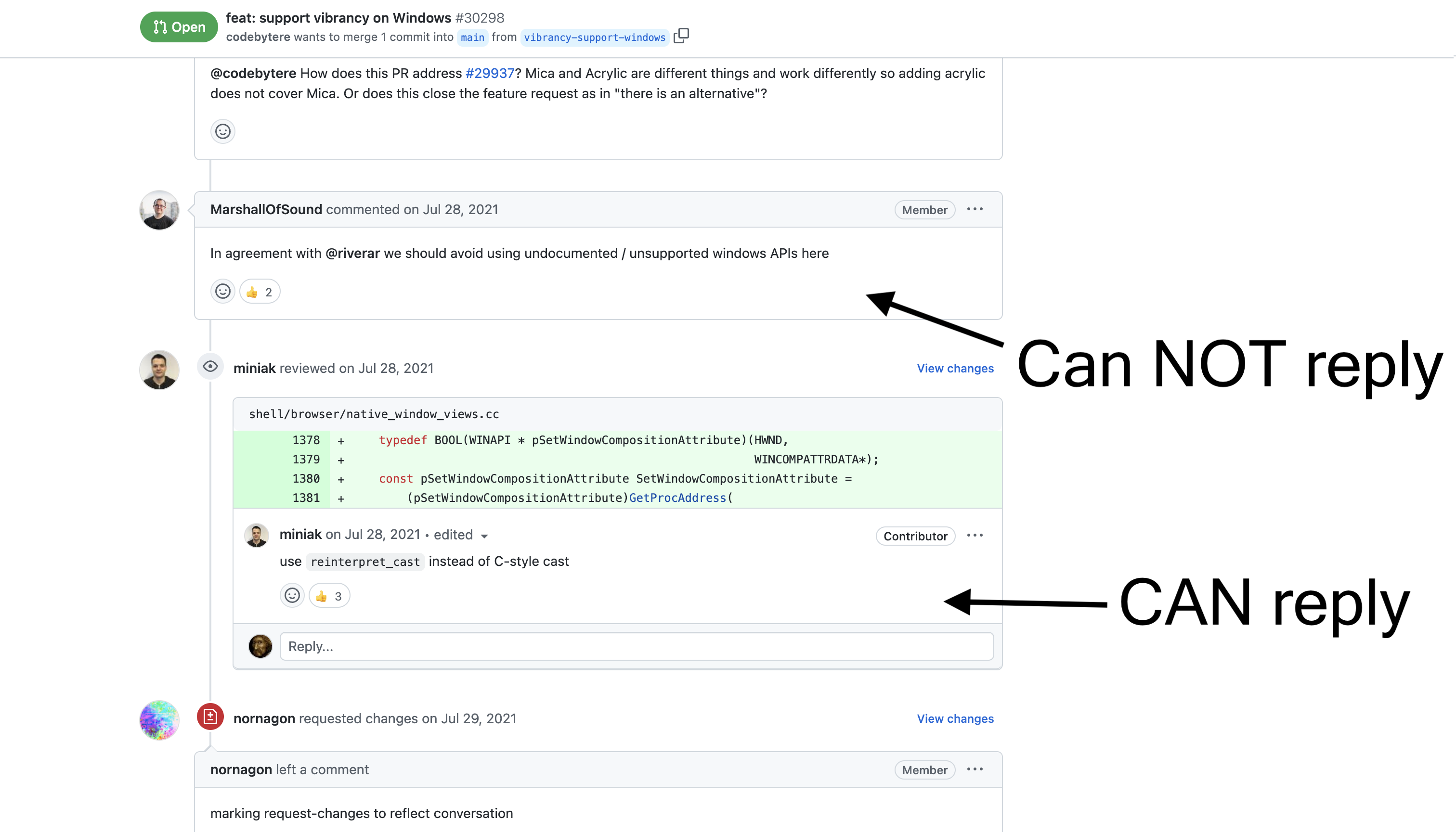
Can't reply to all comments inline
Some comments that are left as part of a review can be replied to. This is nice so that if the reviewer leaves a stupid suggestion, you can tell him how stupid he is inline. But other comments are not able to be replied to, which leads to a lot of back and forth while @-ing people in the main thread. This type of communication is not good because context is not displayed in a contiguous section, but is instead spread out across the page.
Can't leave a comment on a whole file
Sometimes I want to leave a comment on the whole file, and not any particular line number. This is not possible.
Can't filter files by path
Files cannot be filtered by path, you just get one huge list to scroll through.
Of course, you can collapse folders in the tree on the left hand side. But this does not help you much, because you still see all of the diffs in the whole PR.
This is especially annoying because...
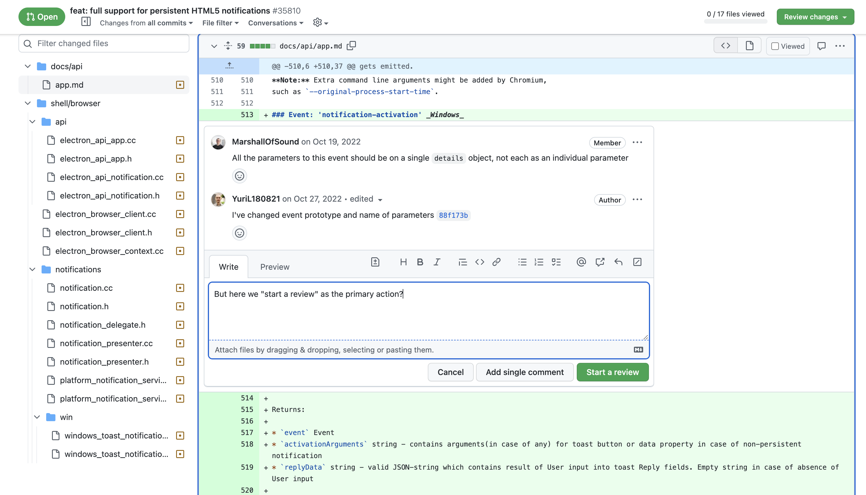
You can't view individual file diffs
The only way to view a file diff is to view it combined with all other diffs in one huge vertical list. This is intimidating.
You can view the individual file in a separate view, but this is just a plain view of the file at a specified commit.
Other tools allow you to see a diff for an individual file on an isolated screen.
GH wants you to "Start a Review" to reply to some comments
Action buttons in the reply to comment pane are different depending on the page you are on.
On the Overview page you get what you expect.
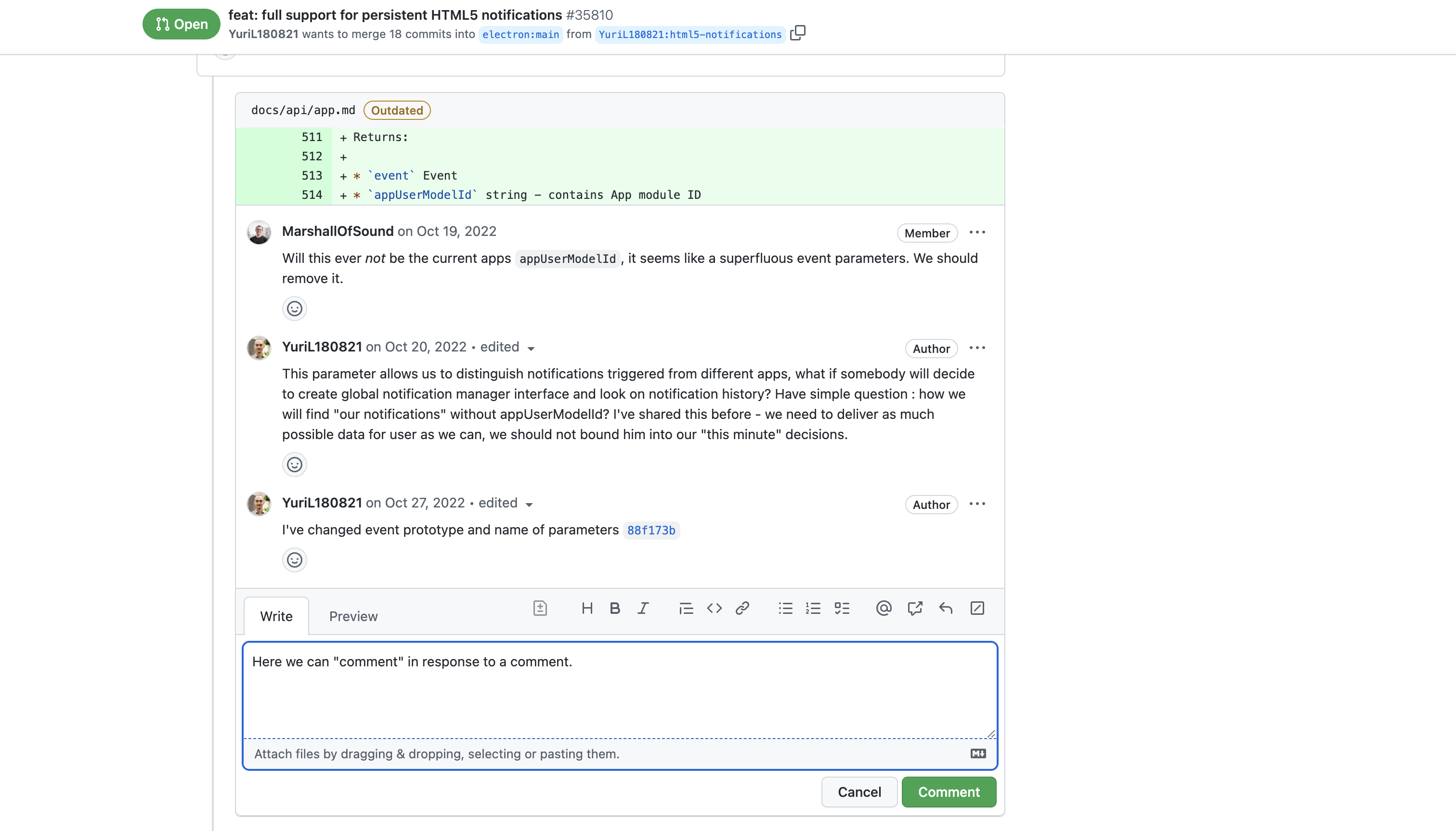
But responding to a comment on Files page, the default action button is to "Start a Review".
This is confusing because the user probably just wants to reply to a comment in either case. Especially if it is his own PR!
For some reason GH shows the "Start a Review" primary button even if it is you own PR. I think starting a review on your own PR makes no sense. You most likely are either driving towards responding and closing comments, or marking them as "wont-fix".
In general, I think that the..
Concept of "review" is too central to GH and its APIs
It ends up just getting in the way.
It would be nice to just be able to comment on a file and request some changes. In GH, you have to start a review, add the comment, then not forget to submit the review (otherwise comment is lost)!
Also, if you come back to a PR after discussing it "offline" with your team and you want to approve it - you have to go through extra steps. The action of approving is not front-and-center. You have to go into the "Files changed" tab first to find the button to approve. This is not great because action and feedback are on different pages
Emails aren't grouped in inbox
When you are interacting with a PR, you would expect that all of the messages show up in the same email thread. But in practice, it ends up creating many threads - and this creates extra mental overhead.
When I'm trying to get through 12 PR reviews, I would appreciate having exactly 12 threads in my email client so that I can delete the whole thread once I review the PR. 😀
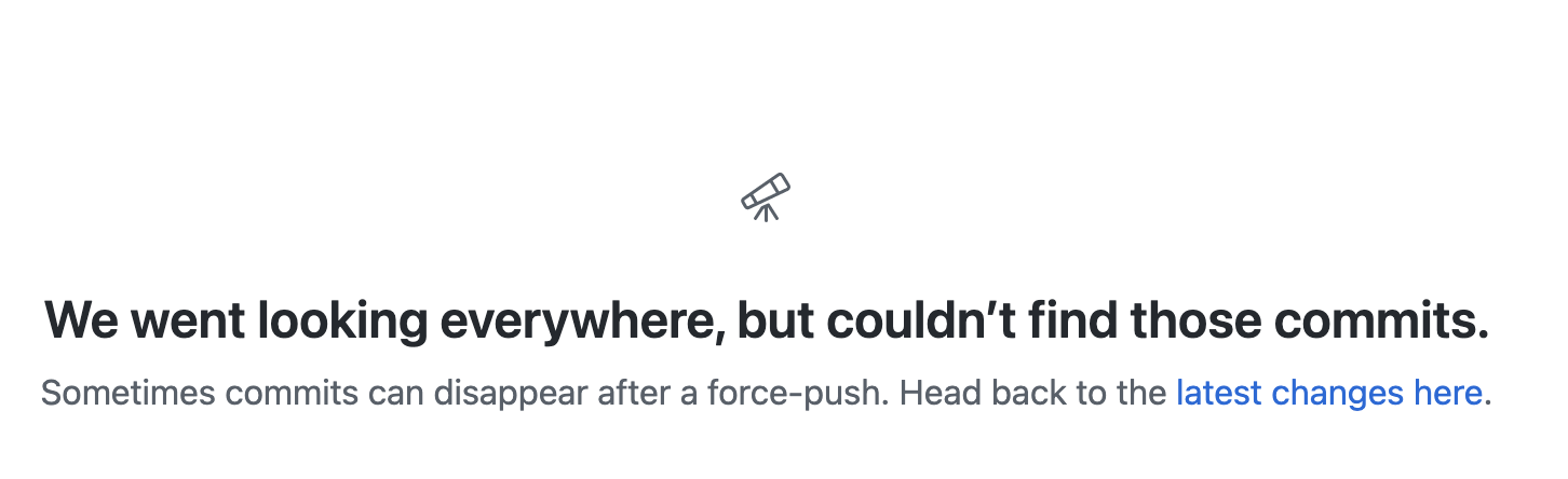
Force-pushe loses history
Power-developers keep their PRs clean with a few logical commits that can be reviewed or added/removed on their own. So it's common to squash commits and force-push to the branch to keep the history clean. A force-push to Github wipes out history though, so it's common to see this error when following links from your email to the PR.
This is another thing that I think Azure DevOps does better. It keeps track of all commits in a PR (which may change if force-pushed over) AND all "updates" (won't change even if force-pushed) in a separate tab.
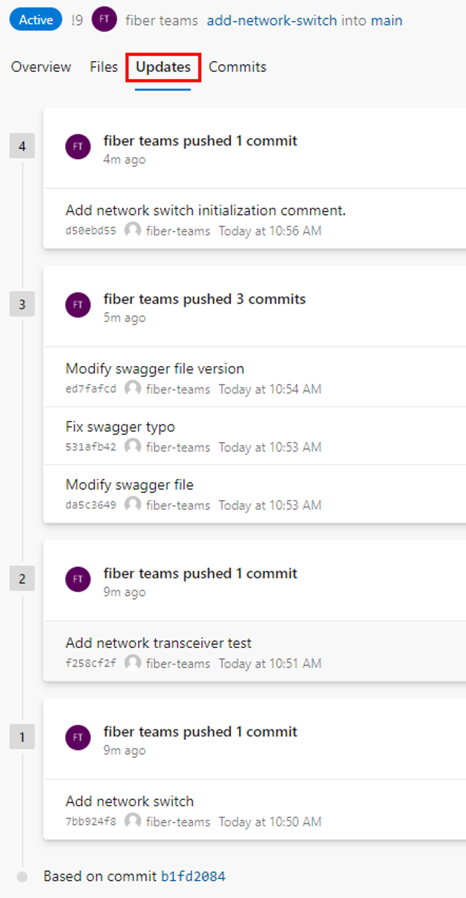
As it is explained from https://learn.microsoft.com/en-us/azure/devops/repos/git/review-pull-requests?view=azure-devops&tabs=browser#review-changes -
Each changeset shows the commits that were pushed in that push operation. A force-pushed changeset won't overwrite the changeset history and will show up in the changeset list same as any other changeset.
Icons and text are too small
Some icons are too small, which leads to poor accessibility and a strained user experience. For example, adding other reviewers is hidden in a small icon on the right side.
All the points above make it so that reviewing PRs on Github is a chore and is not fun. If anyone at GH comes across this post, plz fix. 😆